Image Carousels Must Go

Image carousels are a very popular way of presenting a whole lot of information on a relatively small, yet very valuable piece of your website’s real estate. The appeal of this is clear from a client’s perspective: I don’t have to decide which piece of my content is the most important. On the surface, the image carousel (or slider, or slideshow) is a useful compromise when our team asks the question “What is the single most important message about your brand?” When we dig in past that surface, though, the carousel is not the clean solution it may seem to be.
From our perspective as the team trying to translate your brand strategy and philosophy into the medium of web, the single worst mark against the carousel is its indecisiveness. Simply put, it is our job to simplify your marketing and branding message into an easily understandable message and your company structure into a clear hierarchy of organization. This makes it easier for your users to digest on the User Experience/User Interface level, and easier for search engines to parse for beneficial Search Engine Optimization. The use of a carousel dilutes what would otherwise be a strong, focused value proposition and call to action into multiple weaker, less targeted calls that are often frustratingly hard for your audience to consume before they auto-rotate away.
Statistically, the dilution of messaging can be seen happening through reading site analytics. A 2013 study done by Erik Runyon found that in 3,871,819 page visits over five sites in the Notre Dame university domain, an average of only about 3.2% clicked an offer or image that wasn’t the initial one offered in the carousel. Further, the Nielsen Norman Group ran a simple usability study that came to similarly damning conclusions, finding that some users were unable to find the messaging that was supposed to be the primary CTA for the entire site at all.
From a less design-focused UX perspective, carousels are simply bad for accessibility. More and more, the audience for your site will include consumers using accessibility features and devices like screen readers, and using carousels disrupts the ability of these users to move through your content naturally. Accessibility expert Jared Smith breaks down the difficulties this way:
“Beyond usability frustrations caused by carousels for all users, there are several distinct issues for users with disabilities. For auto-playing carousels, having content automatically disappear can cause loss of focus for screen reader and keyboard users that are reading or have keyboard focus on that content when it animates away. This can force the user back to the top of the page.
There also is no easy way to semantically or programmatically associate the controls for a carousel—often just numbers or dots—with the carousel content. This is especially difficult for users that cannot see the interface. The cognitive load and distraction caused by carousels can be especially difficult for some users with cognitive and learning disabilities.”
Smith went so far as to create a slightly tongue-in-cheek site to illustrate this point: shouldiuseacarousel.com.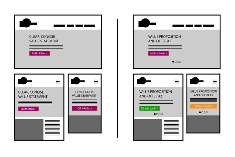
So what should replace the carousel as the focal point of your homepage? A clear, concise value proposition and a call to action that balances a valuable offer with a suitable payoff. It is often tempting to follow a trend in site design simply because it is ubiquitous, but it’s vital that we think through each site’s value as a tool and balance design with function to deliver the best user experience possible for our clients. There is no point in looking trendy if your site is rendered unusable.

